Fresh Finds
Rewarding Recipes at the Tip of Your Finger
About FreshFinds
FreshFinds is an online service where users go to find new and exciting recipes to cook at home. This service is user centered, and provides multiple different ways to search for recipes. Once a user has found a recipe they will be able to create an interactive grocery list that lists off all of the ingredients that they do not already own, reducing unnecessary food waste.
User Research
I want to know why users are less inclined to cook food at home, and more inclined to eat out; so that I can find ways to promote healthier eating habits.
Participants
9 Participants
Ages: 18 - 38
5 participants are Male
4 participants are Female
Cooking skill level - Beginner to Above Average
Lifestyle - Busy
Findings
Users were looking for a service that was enjoyable to explore, reduce food waste, and keep them on task when shopping for ingredients.
Pain Points
Food waste
Unnecessary spending
Difficulty finding new recipes
Quotes that Stand Out
“I try to find recipes based on the ingredients I already own because I hate having to throw food away. Just the other day, I threw an entire box of spinach away because I purchased it for a recipe, and didn’t know what to do with all of the left overs.”
— Tony S
“I only choose recipes when I can see images of the food. Being able to visualize my meals makes me more inclined to cook those meals at home. If it looks good, I’ll make it.”
— Sarah G
“I make a shopping list where I categorize the items I need to improve my experience and finish shopping quicker. I start from the left of the store, to the back, to the right side of the store; then I’ll go down any isles I have remaining.”
— Fallen B
Tony D. Moore
Tony is a software engineer for a company called Northrop Grumman. He works 40 hours a week and has difficulty managing his time outside of work. He mainly cooks breakfast and dinner at home, and will often times eat out for lunch. When he eats out, he tries to eat healthier food options.
Wants:
To stay focused on the items he needs to purchase when grocery shopping
More variety in his meals
More nutritious meals
Pain Pints:
Unnecessary Purchases when grocery shopping
Forgetting Ingredients when grocery shopping
Eating unhealthy foods
“I find myself veering away from my sopping list and purchasing things like ice cream and crackers along with the ingredients for the recipe. But when I get home, I’ll often find myself eating the snacks that I buy for dinner instead of making the original recipe.”
Affinity Mapping
Affinity mapping is a very effective tool when determining which pain points to tackle for the project. During my user interviews, the main pain points that were most common revolved around: variety of recipes/meals, pricing of ingredients, poor shopping experience, and food waste.
Pain Points
Food Waste
Users mentioned that their least favorite part of cooking at home is the food waste that can occur due to having left over ingedients.
Too Many Options
On multiple occasions during the user interviews, users got frustrated with cooking at home because it was difficult for them to find meals that were both creative and easy to cook.
Unnecessary Spending
2 Users mentioned that they hate going shopping because they will often get side tracked and purchase items that were not on their grocery list. This results in the user eating the items they purchased instead of cooking with the ingredients they purchased.
Solution
The solution to these user pain points is to create an online service that provides the user with recipes that are simple, cheap, and healthy. Finding recipes can be done in 4 primary ways. The user will be able to: search for a recipe by name, search for a recipe by the ingredients they already own, find a recipe by exploring different cuisines on the service, or generate a recipe at random. Having these 4 options will provide the user with easy access to new recipes without blocking their creativity.
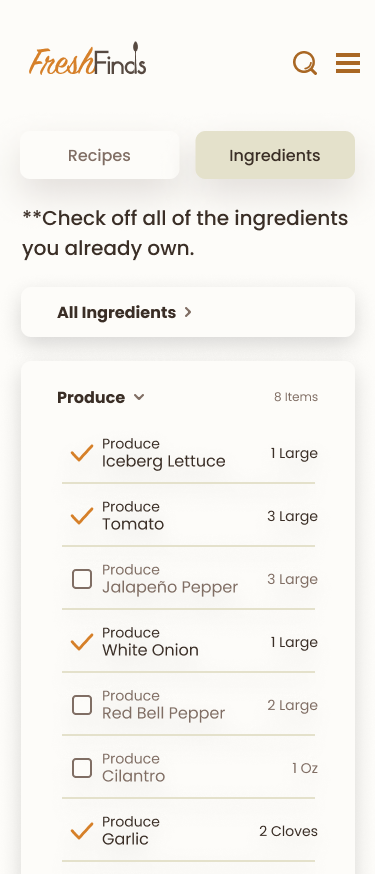
There will also be a grocery list option that the user can utilize. This will be in effect when a user saves a recipe to then make sometime that week. Once a user saves a recipe, they will be given a grocery list with all of the ingredients that the recipes use, categorized in an order that makes shopping as effective and painless as possible.
Feature Set
Search by Ingredient
The most common pain point users had was food waste. Users would have ingredients left over from previous meals, and not know what to do with those ingredients, eventually throwing them out. This feature allows the user to search for a recipe based on the ingredients they already own, reducing the overall food waste.
Interactive Grocery List
Several users mentioned that they will make unnecessary purchases when navigating through a grocery store. This is the biggest frustration when users are physically shopping. Making an interactive grocery list where users can see all of the ingredients required for their recipes grouped in categories, will allow for a better shopping experience while simultaneously reducing unnecessary spending.
Random Recipe Generator
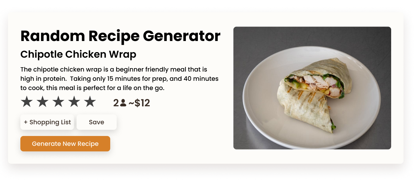
This feature allows the user to generate a recipe at random with a click of a button. If the user is not interested in the generated recipe, they can click on the button again. This gives the user creative variety when searching for recipes, solving the major pain point of users being overwhelmed with too much variety to choose from.
Must Have
Account Creation
Search Bar
Filters
Favorites Button
Recipe Images
Subscription
Could Have
Pricing of Recipes
Food Questionnaire when opening service
Modules that showcase recipes
Visual of Recipe
Future Addition
Categories based on types of Foods
Recipes recommended based on cooking experience
Advertisements for Free Users
Reviews of Recipes
Discussion Boards
Site Map
Exploration was the main idea backing my design. I wanted to focus heavily on simple pathways and easy navigation through the service.
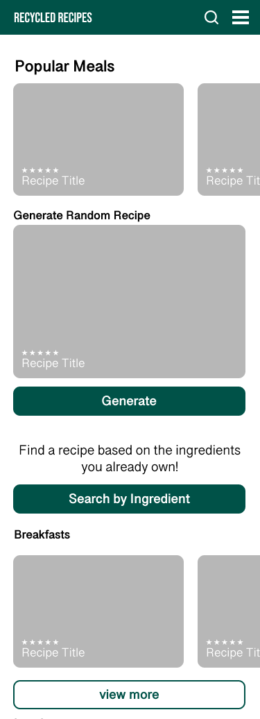
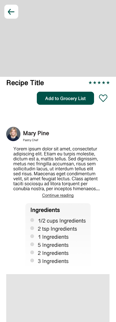
Low Fidelities
Once finishing the User Research for this project, I started focusing on the UI elements and creating the low fidelities for this service. I wanted my project to focus heavily on imagery to drive positive user experience with predictable interactions.
UI Components
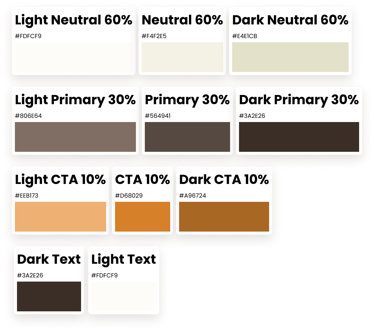
For the color scheme of my project, I used the 60, 30, 10 rule where the neutral color (cream) fills the majority of the website, 30% being the (dark brown) primary color, and 10% being the (Orange) Call to action. This Call to Action color encourages users to interact with various elements such as the save button.
Search By Ingredient
With food waste being the biggest pain point, I wanted to focus heavily on ways to reduce this by allowing the user to search for a recipe based on the ingredients they own. They can check off ingredients they have and a list of recipes that use those ingredients would generate below.
Random Recipe Generator
With users being overwhelmed by the amount of recipes on different services being a big pain point, I wanted to give my users a quick and creative way to find recipes with a click of a button.
When the user clicks on the “Generate New Recipe” button, the current random recipe would be replaced with a new one.
I had plans to make this function work with dietary restrictions as well, but was not able to with the timeframe I was allotted.
Grocery List
Once users have picked a recipe to cook, this service will give users an interactive grocery list that is categorized to improve the shopping experience by grouping similar items together. Users will also be able to view the ingredients for each recipe.
Iterations
After completing the usability testing, there were a couple of steps that my users struggled with, primarily exploration by cuisines and setting up a shopping list through the service. The pain points stemmed from the organization of the different elements and misunderstanding of text. To tackle these issues, I reworked the navigation throughout the service, and changed the text to be easily understood. I also altered different elements to make the interactions more predictable for the user.
Shopping List Button
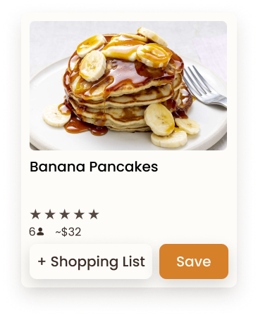
The add to list button was not understood clearly during the user testing. So I came up with a redesign for it so that it was more obvious to the user. Changing the button from “Add to list” to “+ Shopping List” now made it obvious to the user that clicking this button will provide them with a shopping list for that specific recipe.
Before
After
Iterations on the Search Results
After the usability testing, during task 2, users were looking for the “search by ingredient” function under the search bar. I decide to add the “search by ingredient” function underneath the search results as well as on the home page. This will improve the overall predictability of my service when people are trying to find certain recipes.
Before
After
Navigation Bar Iterations
I made quite a few modifications to the Navigational Bar to improve the user experience. I started by changing the ingredients list tag to shopping list, since that was the biggest issue that my users ran into. I then added another tag called Meal Options which provides the user with world cuisines and also dietary restrictions.
I then ordered the Nav bar to give a better flow when navigating through the website. Users will start at the home page, find and save recipes, then add the recipes to the shopping list.
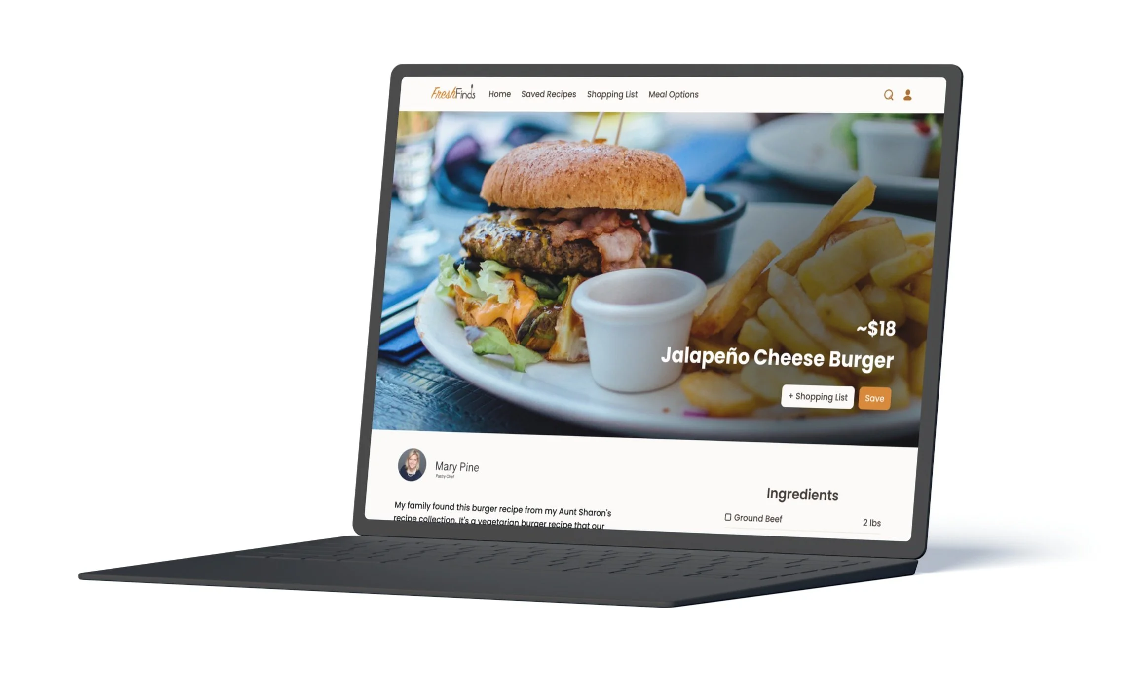
Desktop High Fidelities
Mobile High Fidelities
What I Learned
How I tackled this project.
FreshFinds was the first project that I worked on, so there was quite a big learning curve when tackling the User Research side of things. The main reason that I decided to tackle healthy food habits as my topic was because I felt that it would be easy to find participants for the user interviews since cooking at home is a fairly universal skill. I also wanted to focus more on the user research side of the project more than the UI portion, since user research was a new to me. Focusing heavily on the site map and the user flows allowed me to focus more on the predictability of the designs and tackle the root of the pain points.
What I Learned
The biggest thing that I learned when progressing through this project was how detrimental assumptinons can be when focusing on the user research. At the very beginning of this project, I had some pretty strong assumpitons in regards to eating out and eating unhealthy foods. This led to me coming up with leading questions and close ended questions for the user interviews; which in turn skewed the results of the user interviews. I ended up doing a round of follow up non-leading open ended questions after the interviews completed to gather further information and provide a better affinity map.
What I would do Differently
If I were to redo this project I would focus on preventing assumptions and removing leading questions during the user interviews. This would have improved the results of the user research and allowed me to get to the root of the pain points quicker and more effectively. Although this was a very big set back for me, learning this lesson early on in my UX/UI career gave me insite about how I can remove bias when researching for pain points.
Future Plans
When working on this project, I had the idea of adding a quick survey when first creating an account that asks the user about their cooking skill level, to then give recommended recipes based on their experience. This will allow the service to better connect with the user.
View my other projects!
Add a Feature to Netflix
Website Redesign
End to End App Design
