Meet Alex
Alex is an avid outdoor climber with years of experience under her harness. She is a college student studying mechanical engineering and works as a part time receptionist at her local chiropractic facility.
Wants:
Outdoor events to join and build her social circle
Wants to make outdoor climbing more accessible and safer for other climbers
More Outdoor Activities
Important to the User
Social Groups
Outdoor Activities
Enjoys Challenging Herself
Pain Points:
Has cancelled an entire climbing trip because the fixed climbing gear was not safe to climb on
Budget Restrictions
Wants more difficult climbs outdoors
Wants a bigger/better outdoor community
“My outlet is Climbing, my community is climbing. Nothing brings me more joy than sharing my favorite activity with others, and bring newbies into the sport and seeing their faces light up, theres just no better feeling!”
“I feel like the donation page is a scam, and is just gonna take my money and not donate it.”
“It is really hard to get to a specific page on the mobile website. Everything is just too small.”
About the Project
This is a project I worked on through DesignLab. I was a UX/UI Designer for PPCA during this project, working with stakeholders to come up with a proposal to enhance the digital presance of Pikes Peak Climbers Alliance, a non-profit in the Pikes Peak region of Colorado.
Project Goals:
Conduct usability testing on the existing website to identify pain points affecting user outreach, usability, and accessibility.
Develop a comprehensive website redesign proposal aimed at improving user experience and engagement.
About Pikes Peak Climbers Alliance: The Pikes Peak Climbers Alliance is dedicated to enhancing the quality and experiences of outdoor climbing while ensuring continued open access to climbing areas in central Colorado. Their mission is to advocate for the climbing community by responsibly representing its interests to land managers through open dialogue, collaborative projects, and partnerships.
So, the big question… How do we help Alex?
Answer: Through User Research
The purpose of this project is to determine the pain points that users have when exploring the Pikes Peak Climbers Alliance website. This is to identify issues that occure when viewing the website, and make adjustments to the current website to encourage exploration.
I decided to focus my User Research through Usability Testing. This is because there is already an existing website that users can interact. It will also give me an idea of what Iterations need to be made to create a mobile website that is easy to interact with.
Participants
I had 5 people, already associated with the climbing industry in one way or another, test the current website.
Age: 20-25
4 men and 1 woman
Findings
Most of the users struggled with the navigation on the mobile version.
Every user abandoned the tasks regarding finding important information on both the Garden of the Gods page and the Pikes Peak Information Page due to Information overload.
Two Users were not able to find the Sign In button on the Home Page.
Every User was able to sign up for the newsletter.
Users were visibly frustrated with the layout and aesthetics of the homepage.
Every user found the Ecological Study page to be laid out in a way that was engaging and accessible.
Affinity Mapping
The affinity mapping was based on the results of the usability testing, and the user’s responses to the current website. The majority of users took issue with the mobile version of the website given that it was a scaled down desktop version. This made it very difficult for users to navigate through the website, encouraging users to abandon tasks at hand.
Navigation
Navigation through the website was very difficult for the users, especially when navigating on a mobile device.
Many of the users were visibly frustrated with the navigation that the website had.
Donation Page
The donation page for the website was one of the biggest issues users found when going through the website.
One user was quoted as saying “It looks like it is going to give my computer a virus.”
Information Overload
Specific information was very difficult for users to find throughout the website due to information overload and lack of proper layout.
Pain Points
Navigation
Navigation through this service is very difficult and provides the user with an unpleasant experience. This is primarily an issue with the mobile service as the mobile website is a scaled down version of the desktop.
Information Overload
The amount of information on each page is very claustrophobic. The information provided is very important but the layout of the information leads to abandonment more often than not.
Difficult to Donate
On several occasions during the usability testing, users mentioned that they would not feel comfortable donating their money to this non-profit because of how the donation page looked. One user mentioned that if she were to donate, she would be concerned that her computer would get a virus.
Solution
To help Alex and other climbers like her, I will be redesigning this website from the ground up, focusing on making the website more user friendly by adding easy to use and predictable navigation, reducing the information overload by splitting the information up on each page (making it easier to read), and making an entirely seperate website layout for mobile. This will provide the user with a better experience, and reduce abandonment of tasks.
I will also redesign the donation page to make it more user friendly and have it look more professional to encourage more donations to the non-profit.
Feature Set
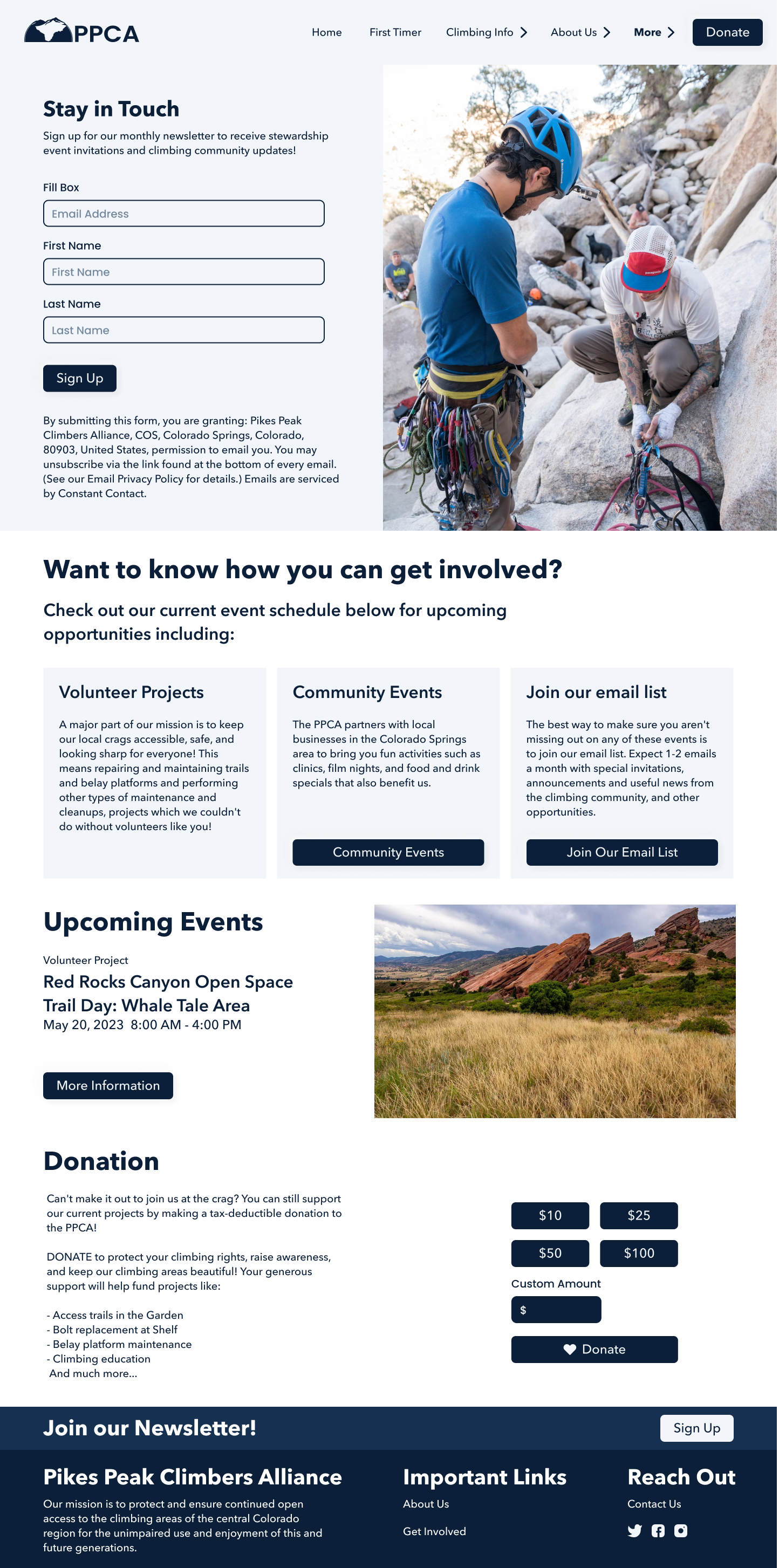
Newsletter Sign Up
The newsletter is the PPCA way of building a community and to improve the outreach to the public. For the redesign, I wanted to make the news letter one of the most important call to actions, encouraging users to sign up.
Functional Navigation Bar
The current navigation for this website is very poor for mobile users. Adding a dropdown hamburger menu will improve the overall navigation for users when using the website, and encourage the user to continue to explore the remainder of the website.
Donation Button
Instead of having a donation link where the user is redirected to a place outside of the website, adding an actual donation tab where the user can input a specific amount they would like to donate directly through the website will raise the amount of donations PPCA gets, and improve user confidence when making that donation.
Must Have
Contact Us
Educational Videos
Social Media Links
Could Have
Committe Voting
Maps to climbing locations in Colorado
Future Addition
Sign up/ Sign In
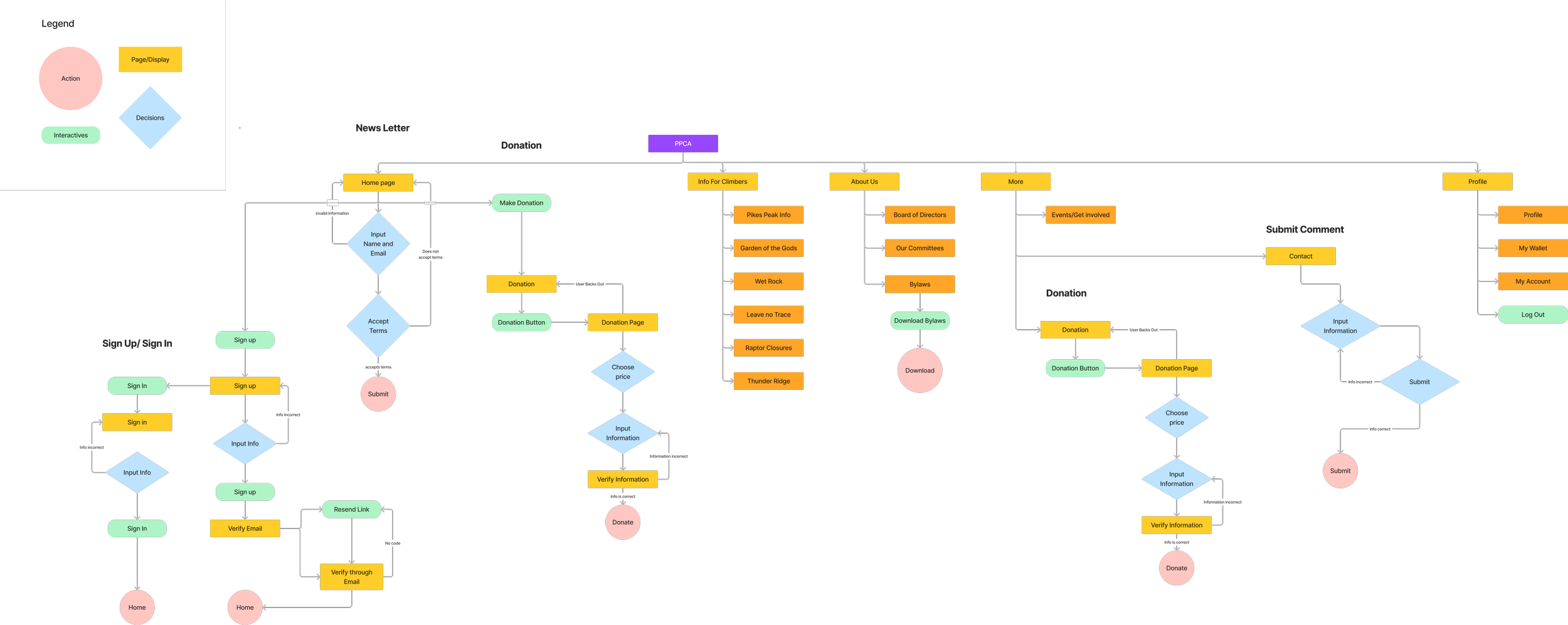
User Flows
I wanted this website to be as predictable and responsive as possible without increasing the amount of steps the user needs to take to complete tasks. My main focus was to focus on making every task accessible with the press of 3 or less clicks.
Low Fidelities
For this project, PPCA asked me to design a more modern version for their website. After going through their current website, I decided to focus heavily on imagery to encourage audience exploration and keep the user entertained when reading through all of the information provided by PPCA.
Desktop Low Fidelities
My main objective for the desktop fidelities was to make the website more engaging for the audience. I planned to do this by improving the organization of information provided through proper padding and separation of important information with gestalt principles, and adding imagery to encourage user exploration.
Mobile Low Fidelities
While working with PPCA, Josephine (Secretary of PPCA) and I discussed the whether or not PPCA should have a mobile version of the website. After looking at the data analytics, we found that the majority of users visited the website on their mobile devices. I decided that the priority for this project should be to make a mobile version of the website. My secondary objective was to make the website more engaging for the audience through organization of information and imagery.
Home Page
I designed the home page with imagery in mind. I wanted to create a webpage that encouraged exploration. PPCA wanted me to make the Newsletter the primary Call to Action for this page.
Location Pages
These pages are dedicated to various climbing locations in the Pikes Peak Region. Each page has information specific to climbing in these locations. E.g. Garden of the Gods Prohibits chalk use.
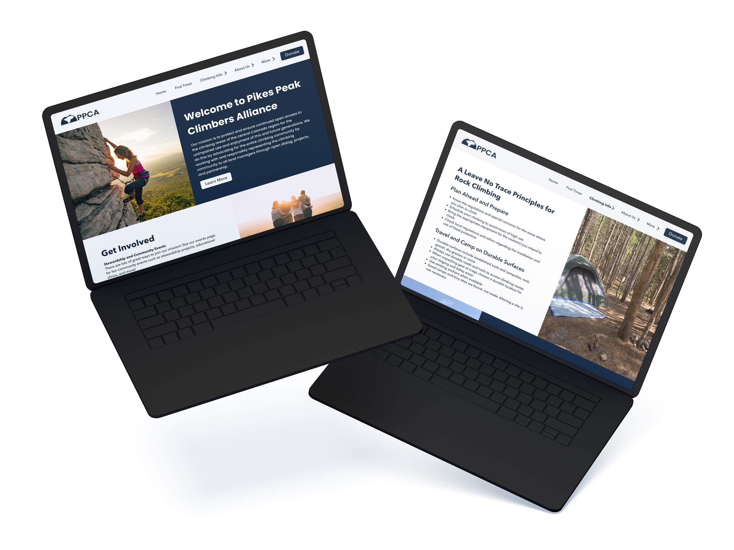
Leave No Trace Principles
One of the most important pieces of information on the PPCA website is Leave No Trace Principles (LNT). This is one of the backbones to the non-profit, so I really wanted to highlight this section. I broke down the information into smaller digestible pieces to encourage users to read through all of the information provided on this page.
Building a Community
Events are the most prevalent way that PPCA builds their community. However, they only host an event every couple of months (6 events annually on average). Since events are the main way that they build the community, I wanted to make the event page easy to access and interact with.
But I also wanted the page to be accessible even if they are not in the process of hosting an event. Therefore I designed this page with the idea that an event might not be showcased on this page.
Committee Page
PPCA has various committees associated with the non-profit. I wanted to ensure that each committee had a section dedicated to their efforts and showcase what they do through imagery to encourage user exploration.
Additions made outside of the PPCA Website
Although the information provided in the PPCA Website is important for people to utilize whenever they would like to plan a climbing trip, I could not help but notice some of the information is lacking for people that are relatively new to climbing outdoors. I wanted to create a couple of pages dedicated to newer climbers in the Pikes Peak Region.
Required Gear Checklist
I decided to add a gear checklist since there are three different types of outdoor climbing, each requiring different equipment to safely climb. With this equipment checklist, users will be able to check off the items that they already own, and email themselves a list of items that they will need to purchase.
Other Popular Climbing Locations
On the current PPCA website, they only showcase 3 locations to climb outdoors in Colorado. However, there are numerous climbing locations in Colorado that PPCA is associated with, but does not showcase in their website. I added this page to better inform the public about the various climbing destinations in Colorado. On this page, users will be able to hover over an image and receive information about the location.
First Time Climbing Page
PPCA’s main audience are people that are somewhat new to the outdoor climbing industry, and are interested in getting more involved in the industry. Creating a page dedicated to going outdoors for the first time is an important feature that should be added to this website given the non-profit’s nature. On this page, users will be informed about all they need to know about outdoor climbing and climbing etiquette, such as: Leave No Trace principles, Pet Safety, and Common Climbing Curtesy.
Desktop High Fidelities
For this project, PPCA asked me to design a more modern version for their website. After going through their current website, I decided to focus heavily on imagery for the desktop version to encourage audience exploration and keep the user entertained when reading through all of the information provided by PPCA.
Mobile High Fidelities
For mobile, since the screen is smaller, I decided to focus less on imagery and more on the information provided by PPCA. Mobile is the primary way their audience interacts with this website, so allowing for easy access to all of the information was at the forefront of my design.
What I Learned
How I tackled this project.
I was working with one of the non-profit’s employees named Josephine. During out meetings, Josephine mentioned that she wanted me to focus on building a mobile version of the website, and modernizing the current website to encourage more people to explore the website.
What I Learned
This was the first project where I worked with a real client. It was a brand new experience that offered me an example of what a real world UX/UI project would look like. This was one of my favorite projects because it required me to communicate my design decisions to a real client and bounce ideas back and forth.
What I would do Differently
Communication was the most difficult part of this project. Working with a real client was tricky at times, since we had schedules that collided frequently, so our main form of communication was email. In the future, when working with clients, I will take the initiative to set up in person or zoom call meetings on a regular schedule to reduce miscommunication.
Future Plans
When working with PPCA, before starting the low fidelities, Josephine (Secretary of PPCA) mentioned that they were currently in the middle of a rebranding, and that they would have a new corporate identity including a: new logo, new color scheme, and potentially new photos. I designed this website in a way that could be easily altered with the color schemes, to allow for future alterations after the rebranding.
View my Volunteer Work!
View my Projects!
Online Subscription Service
Add a Feature to Netflix
End to End App Design


